
2025 - 2026
B&M Stores — Redesigning Retail Discovery for 2M+ Customers
How we redesigned B&M's native mobile experience to make product discovery, store finding, and everyday shopping simpler across 900+ UK stores.

B&M serves millions of customers through a fast-moving retail network of more than 900 stores. This case study covers both sides of the product: the iOS and Android customer experience, and the web-based B2B management centre used to manage the content and operational workflows behind it. I led experience design across these connected surfaces, turning a large, constantly changing retail system into clearer journeys for customers and internal teams.
At a glance
Role
Lead Product Designer
Scope
Product Strategy · Consumer App · B2B Management Centre · CMS Workflows · UX/UI · Design System · Prototyping · Developer Handoff
Platforms
iOS · Android
Impact
2M+ users · 900+ stores · Shipped product
Context
B&M’s scale creates a specific product challenge. Customers are not browsing a small, predictable catalogue; they are navigating a broad retail experience in which product availability, relevance, and proximity all shape the journey. The app had to support quick discovery without pretending that every store or every customer had the same needs.
The challenge
Customers needed a faster way to discover products and find relevant stores across a retail network of 900+ locations. Search, category browsing, and store discovery existed as related but disconnected tasks. At the same time, internal teams needed a coherent web-based environment for managing the content and operational information that powered those customer journeys.
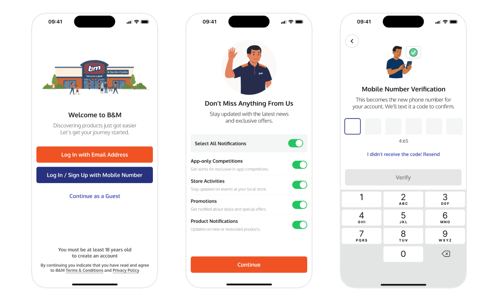
The design problem was not simply to refresh the mobile interface or design an administration tool in isolation. It was to decide what information should appear first, how different discovery modes should work together, how content should be structured and managed, and when the app should ask for contextual permissions without interrupting the journey.
My role and ownership
I led experience design across the customer-facing native app and the web-based B2B management centre, from problem framing and information architecture through interaction design, visual direction, prototyping, and developer handoff. I also designed the CMS workflows used to manage the content behind the app experience. My responsibility was to connect customer needs, operational requirements, and technical constraints into one coherent product system, then stay close to implementation so the shipped experience retained the intent behind the design.
Designing both sides of the product
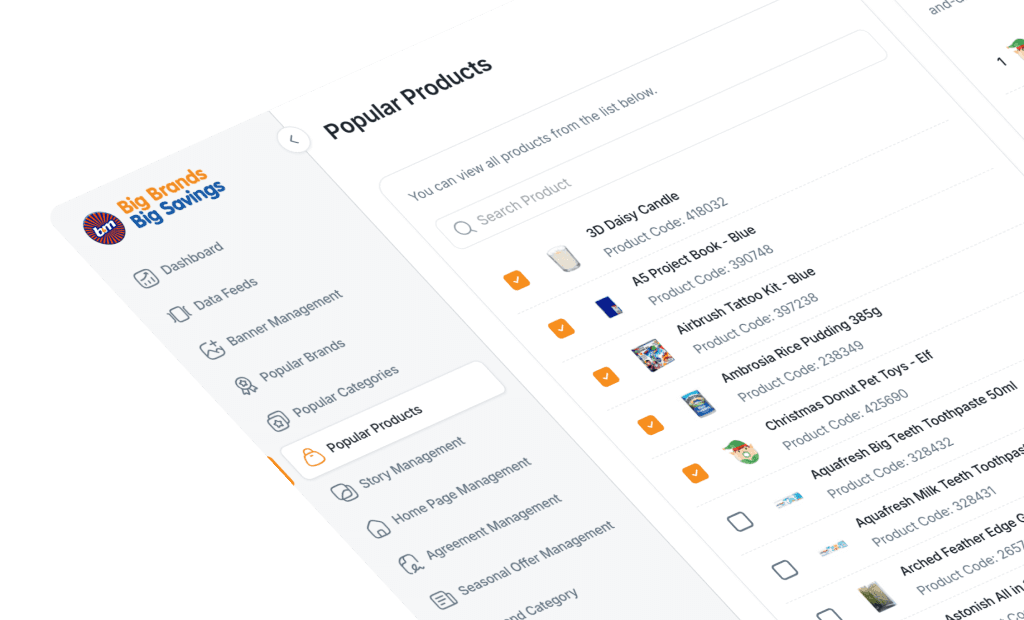
The customer experience depended on a second product that shoppers never saw. The B2B management centre gave internal teams a web-based interface for managing CMS content and the operational information surfaced in the app. Treating that platform as part of the same experience helped ensure that customer-facing journeys were supported by workable internal processes.
I mapped how content moved from management workflows into the mobile experience, then designed the information architecture, interaction patterns, states, and reusable behaviours needed on both sides. This made the CMS work a product-design challenge in its own right rather than a back-office afterthought.
Constraints that shaped the work
The solution had to work across a large store network, respect iOS and Android conventions, remain understandable for frequent and occasional shoppers, and fit the realities of an established retail business. The management centre also needed to make complex content and operational workflows usable for internal teams. Patterns for navigation, discovery, permissions, content management, and store information therefore had to scale beyond a single launch.
Evidence and experience mapping
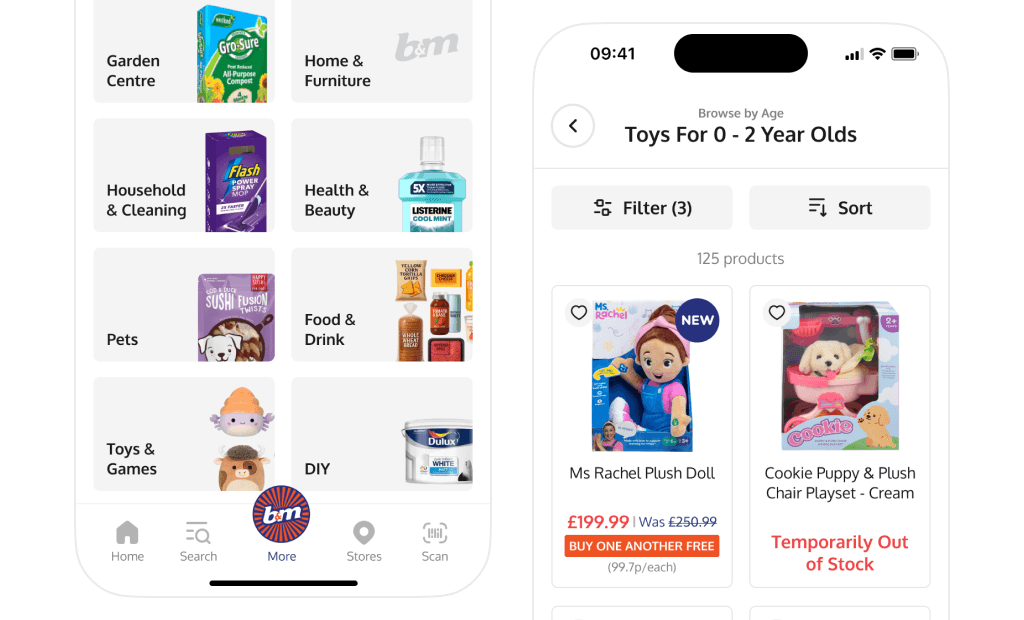
I built the direction by examining the existing experience, mapping the main customer tasks, and tracing the operational requirements behind them. I looked at searching for a known product, browsing without a precise goal, finding a nearby store, and managing the content that supported those journeys. Bringing the consumer and B2B workflows into one view exposed duplicated steps, unclear ownership, and dependencies between content structure and the customer experience. The new direction organised both products around user intent rather than internal features.
Key design decisions
1. Bringing search and category discovery together
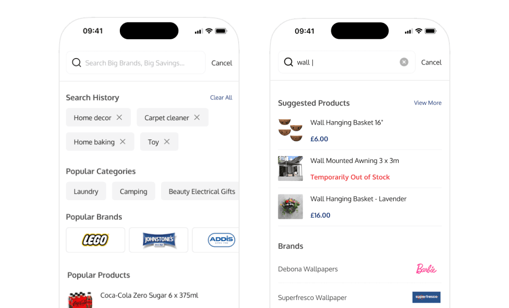
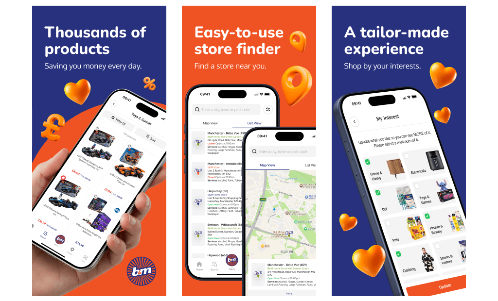
Search and categories are often treated as separate features, but customers move between them fluidly. Someone may begin with a broad category, refine their intent, and then search for a specific product. I brought these behaviours into a shared discovery model so customers could move from exploration to intent without repeatedly returning to the top level. The goal was not to reduce the number of options; it was to reduce the cost of changing direction.
2. Asking for location in context
A system permission prompt shown too early asks users to make a trust decision before they understand the benefit. Instead of opening the native location dialog immediately, I introduced a contextual card that explained why location would improve the experience: it could surface nearby stores and make store discovery more relevant. The system prompt appeared only after the customer chose to continue. This made the request feel connected to a clear outcome rather than an arbitrary technical requirement.
3. Designing store discovery around intent
A store list alone does not answer the customer’s real questions: Which store is closest? Is it open? How do I get there? I prioritised proximity and decision-critical information, then kept secondary details available without overwhelming the first view. This hierarchy helped customers compare locations quickly while preserving the depth needed for planning a visit.
4. Treating the CMS as a product, not a back office
The management centre needed to give internal teams enough flexibility to handle changing retail content without making routine tasks difficult or creating inconsistent customer-facing output. I designed structured, reusable workflows and clear content states that balanced operational control with usability. This connected the quality of the mobile experience to the tools and decisions that shaped it upstream.
From direction to shipped product
The final experience was supported by reusable patterns across both the native app and the management centre rather than a collection of one-off screens. I used prototypes to make navigation, permission behaviour, and key CMS workflows tangible; documented states, edge cases, and cross-surface dependencies for handoff; and worked closely with developers to resolve implementation trade-offs. That collaboration mattered because the quality of the outcome depended on platform behaviour, content structure, and operational workflows as much as the final UI.
The final experience
The redesigned product connected the customer and operational layers of the experience. Customers could search or browse without entering disconnected parts of the app, understand why location access was useful before granting it, and compare nearby stores using decision-critical information. Internal teams gained a clearer web-based system for managing the content and workflows behind those journeys. The result was a simpler customer experience supported by a more scalable product structure.
Reach and product impact
The product shipped on iOS and Android and serves more than 2 million users across a retail network of 900+ stores. Those figures describe the reach of the product rather than a measured uplift caused by the redesign. The product impact was the creation of a unified discovery model and an operational foundation that connected search, category browsing, store discovery, contextual permissions, and CMS workflows across the wider system.
Shipped on iOS & Android · 2M+ users · 900+ stores · Consumer and B2B platforms
What I learned
The most valuable design work happened before visual polish: defining the intent behind customer and operational journeys, making dependencies and trade-offs visible, and deciding what information deserved priority on each side of the system. I also learned that CMS and permission flows should be treated as product experiences, not implementation details. When both customers and internal teams understand the value and consequences of an action, the wider product becomes clearer and more resilient.
Reflection
If I were extending the work, I would measure how customers move between browsing and search, where store information changes a purchase decision, and how permission timing affects completion. On the B2B side, I would also examine where content-management tasks slow down, create errors, or require workarounds. Together, those signals would show where the connected system should evolve without losing the hierarchy established in the redesign.